
Project Overview
The product:
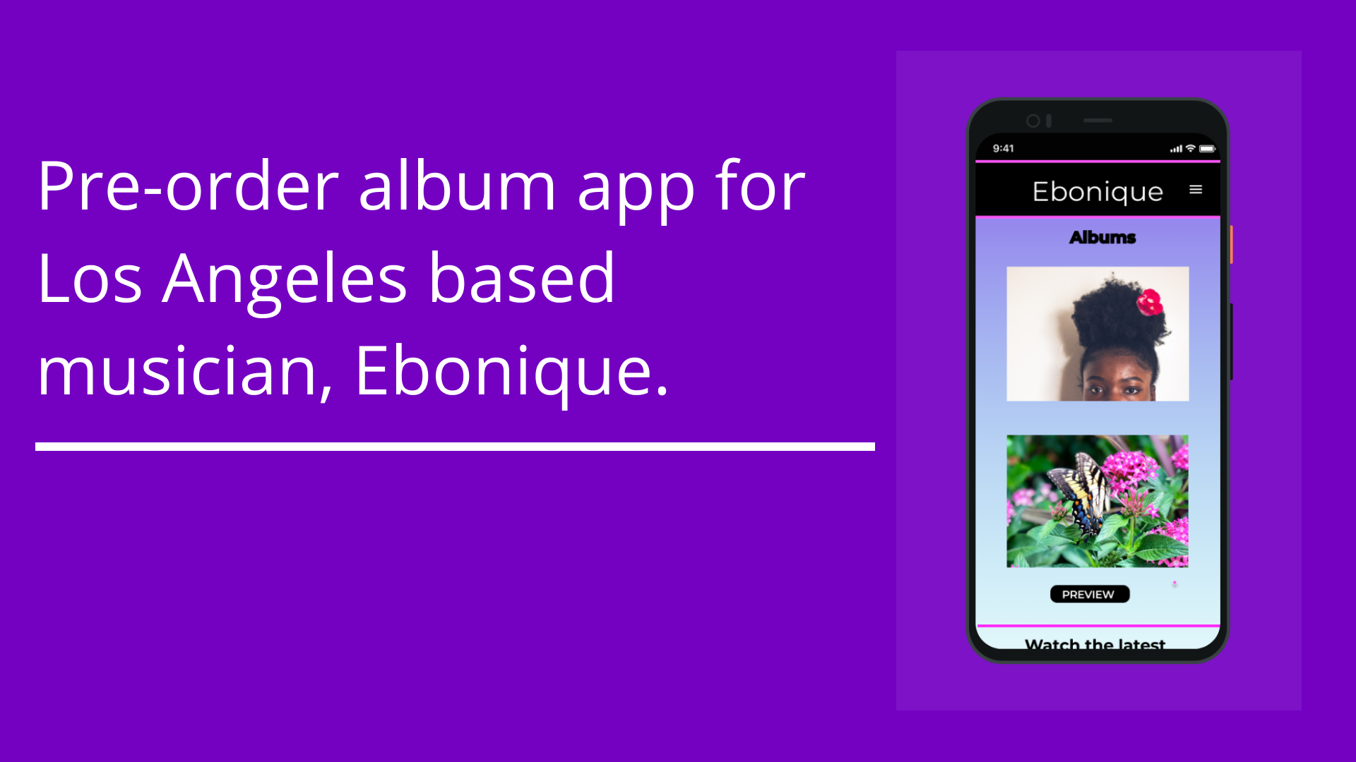
Ebonique is an underground musician based out of Los Angeles. Her popularity is increasing, so she wanted another way to connect with her fan base that aren’t into social media. She wanted a way to stay in contact her fans and engage with any music lovers who enjoy R&B and Rock.
Project duration:
June 2021-August 2021
The Problem:
Connecting with fans without social media regarding upcoming music releases and artist information.
The Goal:
The goal is to create a one stop shop for all things Ebonique. The music app will allow streaming/downloading, in addition to purchasing merchandise and providing a detailed artist newsletter.
My role:
UX Designer involved in all phases of the project, from conception to delivery.
Responsibilities:
Creating personas, conducting interviews and usability studies, paper and digital wireframes, low and high-fidelity prototyping, accounting for accessibility, and iterating on designs.
User research
Summary
I conducted interviews and created empathy maps to understand the users I am designing for and their needs. A primary user groups was conducted to find consumers who listened to the Los Angeles based artist, Ebonique. The interviews proved to be very informative because there were many people who loved Ebonique but the way they accessed her music varied widely. The research also reflected other problems including pre-ordering versus streaming, not knowing release dates and purchasing from other online music stores.
Pain Points
Information - The music release date is not always known.
Time - Working adults don’t always have time to search the internet to find out release dates and can’t pre-order music.
Saturation - There are other well established music stores and streaming services.
Communication - Needs texts, emails, or newsletters to keep in touch with fans that don’t have social media.
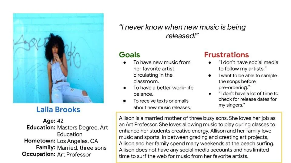
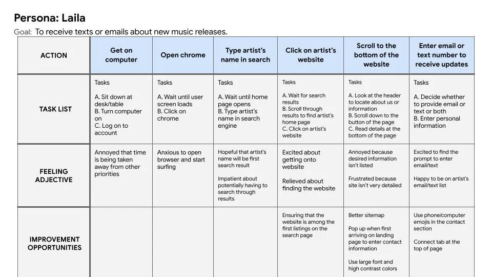
Meet Laila
Persona: Laila’s Problem
Laila is an art professor and busy mother of three sons who needs to know the release date of her favorite artist’s album because she can’t pre-order an album on the app if she doesn’t know when the music is released.
Laila’s User Journey Map
Mapping Laila’s goal reflected the need to have contact information, so musician’s can alert users about upcoming release. If users know about upcoming releases, they might be much more willing to pre-order the album through the app.
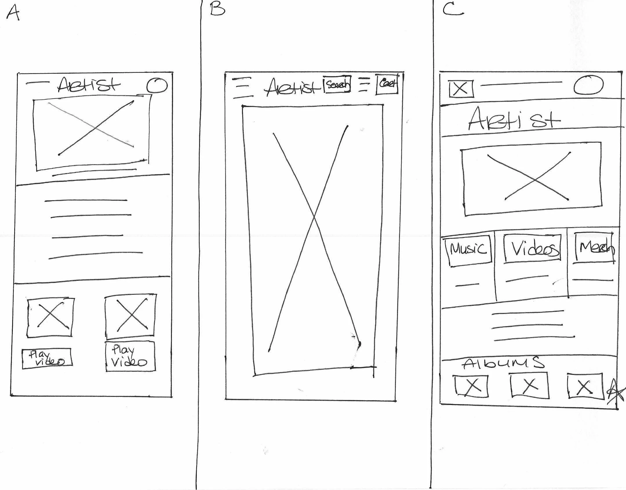
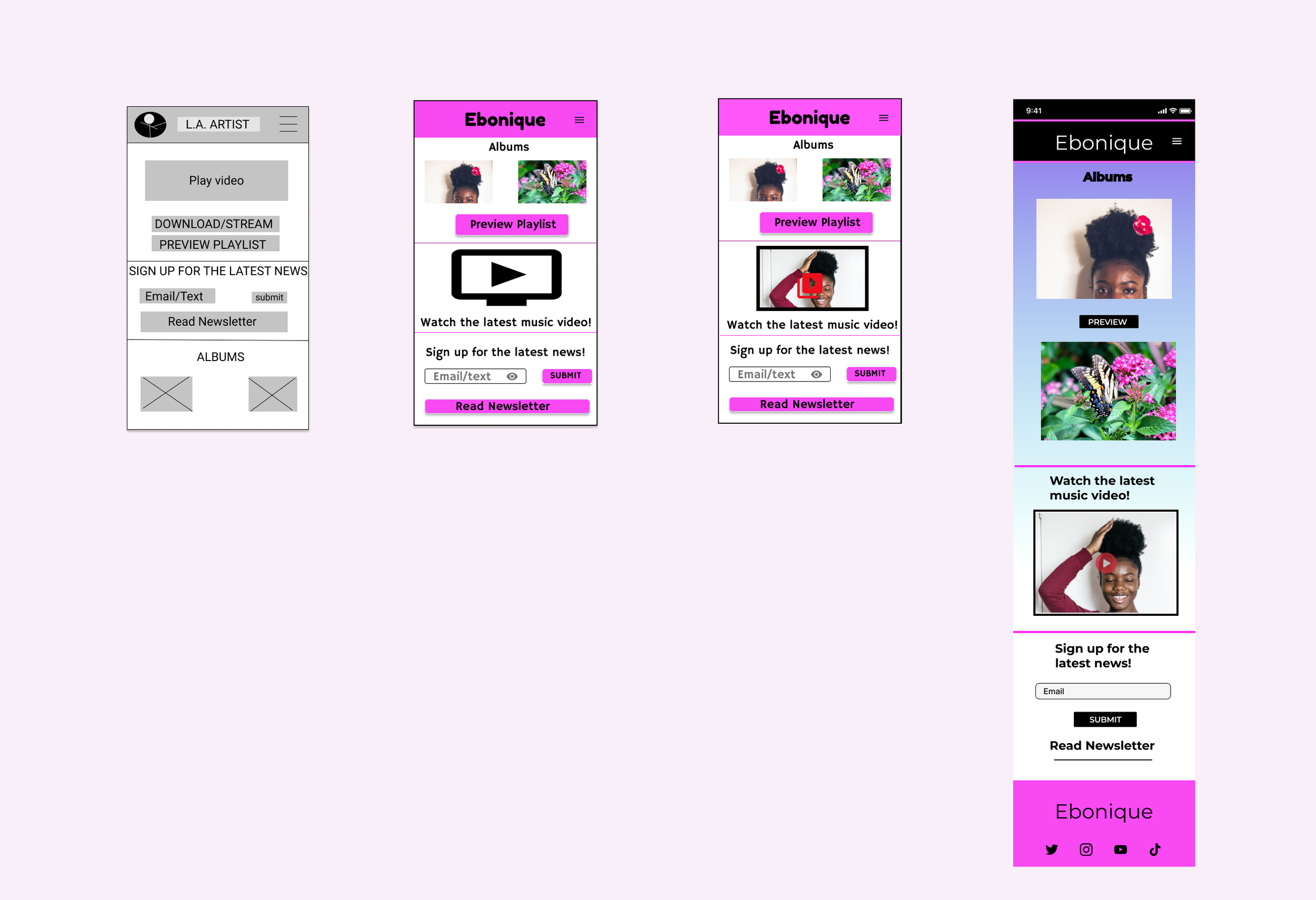
Paper Wireframes
It was really important to focus on the pain points addressing a lack of social media and wanting to know when new music would be released. The home page for this app had to immerse the user immediately with music and ways to stay in contact with the artist.
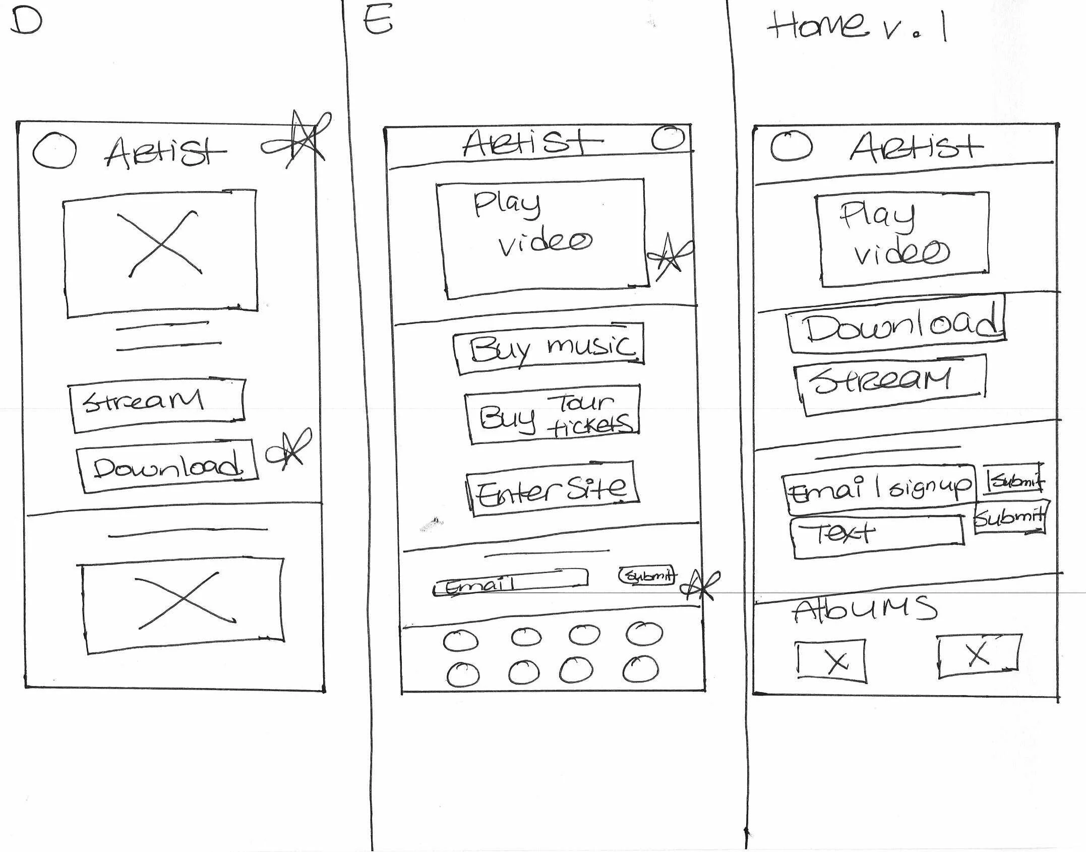
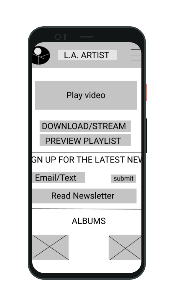
Digital Wireframe
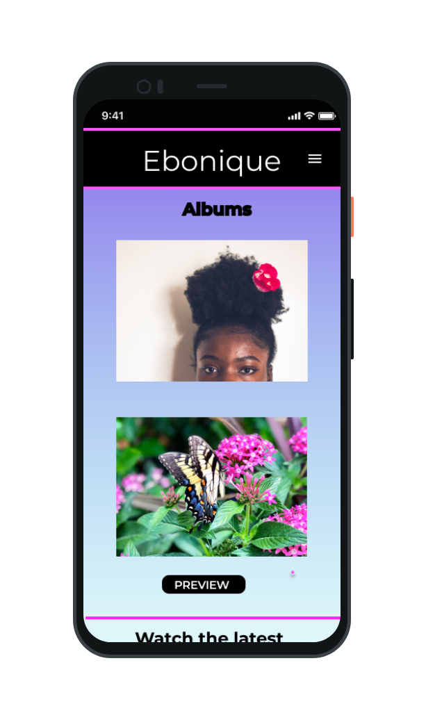
The landing page immediately allows the option to purchase music and provide contact information. The entire home page is filled with music and a video to engage the user with the artist’s brand.
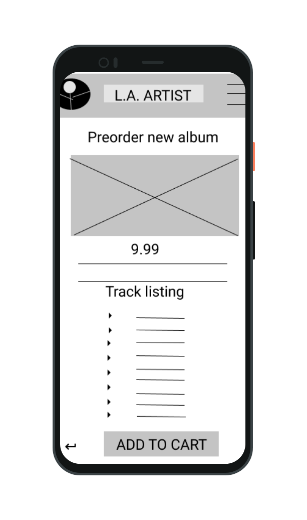
Digital Wireframe
The release date and album playlist are listed. The user is also able to sample each track before making a purchase.
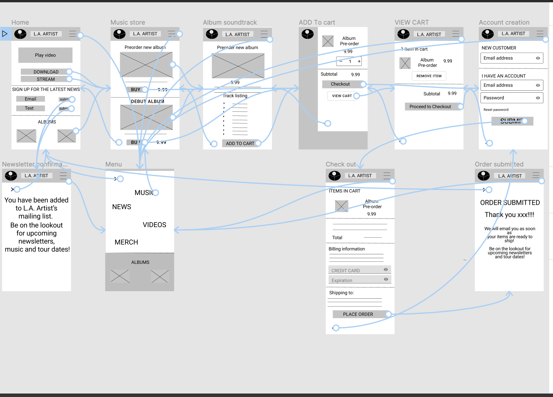
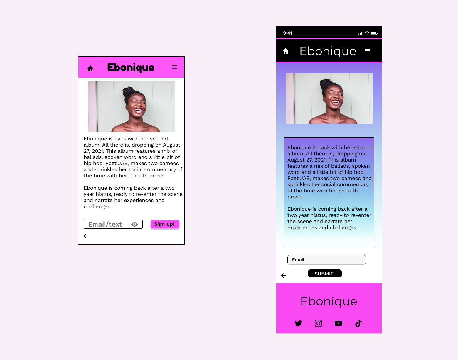
Low Fidelity Prototype
This low-fidelity prototype is a one stop shop allowing the user to sign up for music news, watch videos and purchase music without having to leave the app.
View the music pre-order app.
Usability Study
I conducted two rounds of usability studies. The findings from the first study informed the wireframes and mockups that were designed. The second study used a high-fidelity prototype and highlighted what aspects of the mockups that needed additional refining.
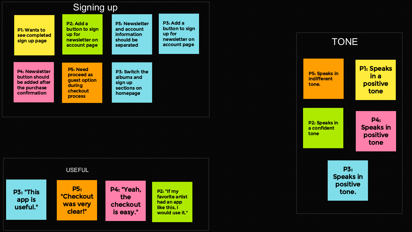
Round 2 Findings
The newsletter sign up feature was redundant on one of the screens
Add account icon on menu screen
Round 1 Findings
Users want the newsletter
An option for guest checkout is necessary
Users want playlist to be available
Analyzing data from the usability study for affinity mapping
Mockups
Early designs focused on making the newsletter feature central to the music and videos. The usability studies indicated that the newsletter was important but so was emphasizing the music. The layout was changed to focus on music foremost followed by videos and the newsletter.
The second usability study revealed that the newsletter and sign up features were well received. Combining the sign up line and button made the request to connect less redundant. I did a complete overhaul of the app changing typography and color to make it more visually appealing for the user.
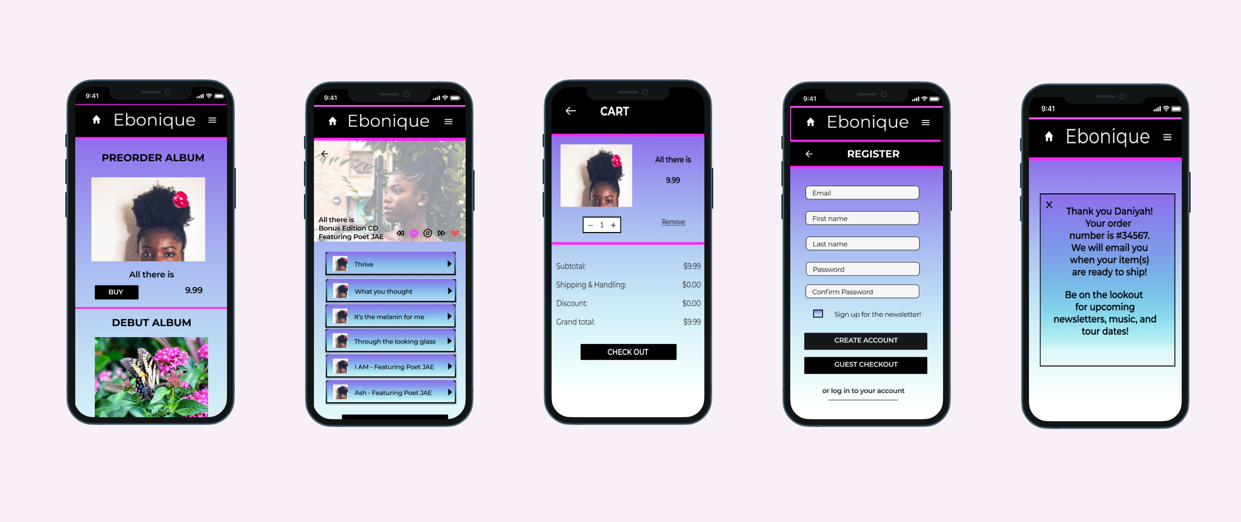
The checkout flow was efficient and quick. The user is given the option to create an account or use the guest checkout feature for guests and account holders.
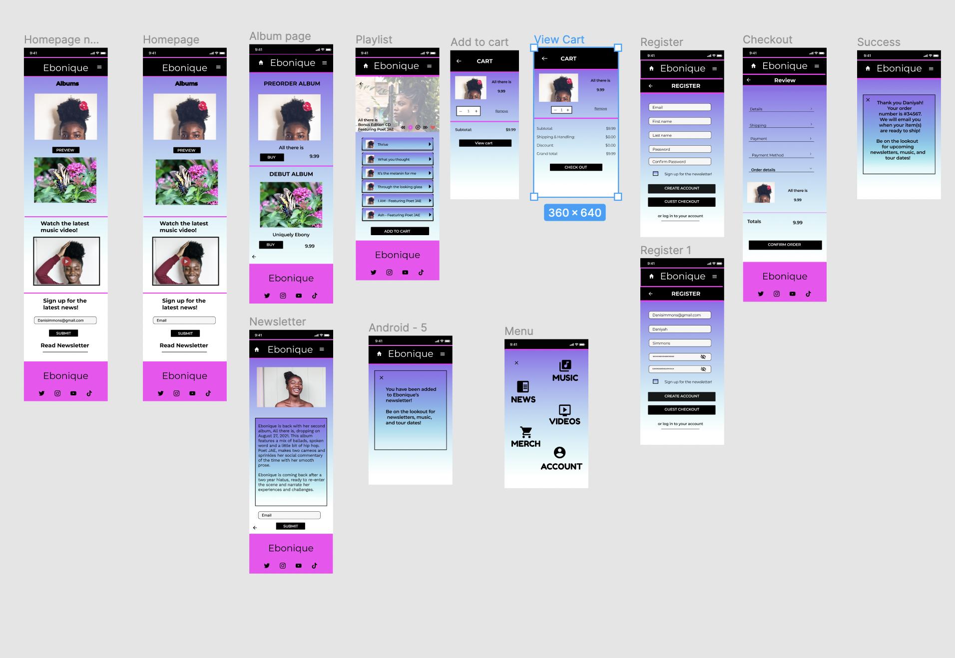
High fidelity prototype
The final prototype provided the user with a way to connect with the musician without social media, ability to preview playlists and a cohesive checkout experience.
View the high-fidelity prototype.
Accessibility considerations
Screen reader technology was utilized by including both icons and words.
Transition between screens were met by keeping the speed between 2 to 4 seconds.
Bold album images and written descriptions were utilized to distinguish albums.

Takeaways
Impact
The app allows users to search for and preview Ebonique’s music while interacting with her brand exclusively unlike other apps that are tailored to more than one artist.
Feedback: “The music purchase was very quick and easy!”
What I learned
This was a great first project. I learned the importance of simplifying music purchases to enhance user experiences in addition to saving time. I also learned consumers will choose the best mode of receiving information that isn’t overwhelming and doesn’t take away from the other duties in their lives to keep up with their favorite musician. User stories and usability studies were extremely critical to the development of this app.